Add this widget to Notion
- Follow this tutorial to create a GitHub repository.
- Copy the code here into a new GitHub file.
- Start editing the file to make it yours!
Change The Button Text
Scroll Down to the end of the code and replace “My Button” with your text
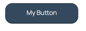
<button class="btn large my-color rounded threeD" type="button" onclick="navigate()"> <i class="fa-regular fa-star"></i> My Button</button>Change The URL
Scroll Down to the end of the page and replace “”https://example.com” with your URL
 <script>
    function navigate() {
      window.open("https://example.com", '_blank').focus();
    }
  </script>
Want the links to open on the same page instead of a new tab?
replace “_blank” with “_parent”
 <script>
    function navigate() {
      window.open("https://example.com", '_parent').focus();
    }
  </script>
Customize The Icon
Remove The Icon
remove this part from the code (right before the button text)
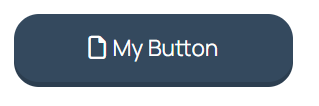
<i class="fa-regular fa-star"></i>So this
<button class="btn large my-color rounded threeD" type="button" onclick="navigate()"> <i class="fa-regular fa-star"></i> My Button</button>Becomes
<button class="btn large my-color rounded threeD" type="button" onclick="navigate()">My Button</button>Add a Different Icon
- Head to FontAwesome.
- Search for the icon you want
- Make sure to filter by “Free” icons
- Click the Code to copy it
- Paste the code right before your button text so the code looks like this
<button class="btn large my-color rounded threeD" type="button" onclick="navigate()"><i class="fa-regular fa-file"></i> My Button</button>Change the color
Use one of the preset colors
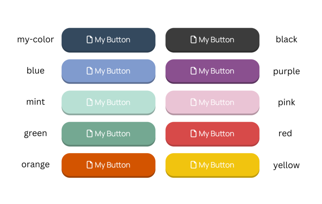
Pick the color you want and replace “my-color” with it.
For example: To make a red button the code should look like this:
<button class="btn large red rounded threeD" type="button" onclick="navigate()"><i class="fa-regular fa-file"></i> My Button</button>Add Your Own Color
Don’t like any of these? No problem
- Go to Google Color Picker and pick a main color and a slightly darker accent color and copy the HEX code for both
- Scroll to the top of the code and find this part
 <style>
    :root {
      --my-color:#34495e;
      --my-color-accent:#2c3e50;
      --black: #3c3c3c;
      --black-accent: #2d2d2d;
      --blue: #809bce;
      --blue-accent: #5c6f94;
      --purple: #8a508f;
      --purple-accent: #5d3661;
      --mint: #b8e0d4;
      --mint-accent: #8ba89f;
      --pink: #eac4d5;
      --pink-accent: #b495a3;
      --green: #74a892;
      --green-accent: #5e8675;
      --red:#d74a49;
      --red-accent:#b53f3f;
      --orange:#d35400;
      --orange-accent:#9e4102;
      --yellow:#f1c40f;
      --yellow-accent:#bd9a0c;
}- replace the color codes here with your own codes
- –my-color:#34495e;
- –my-color-accent:#2c3e50;
- Make sure that “my-color” is applied to your code and not any other color
<button class="btn large my-color rounded threeD" type="button" onclick="navigate()"><i class="fa-regular fa-file"></i> My Button</button>Change The Button Size
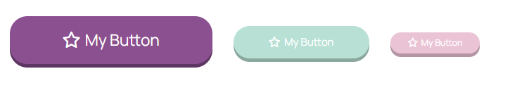
replace the default “large” with mid or small to get different sizes
<button class="btn small my-color rounded threeD" type="button" onclick="navigate()"><i class="fa-regular fa-file"></i> My Button</button>Remove the Rounded Corners
Remove the word rounded so the code looks like this
<button class="btn large purple threeD" type="button" onclick="navigate()"><i class="fa-regular fa-star"></i> My Button</button>Remove the 3D Effect
<button class="btn large purple" type="button" onclick="navigate()"><i class="fa-regular fa-star"></i> My Button</button>Remove the word threeD so the code looks like this